How to choose your home's colours without regretting it
Colour is chosen in five minutes in front of a paint chart at the shop and lived with for ten years. These are the four things we always check before buying the first tin.
Proportions first, tone second
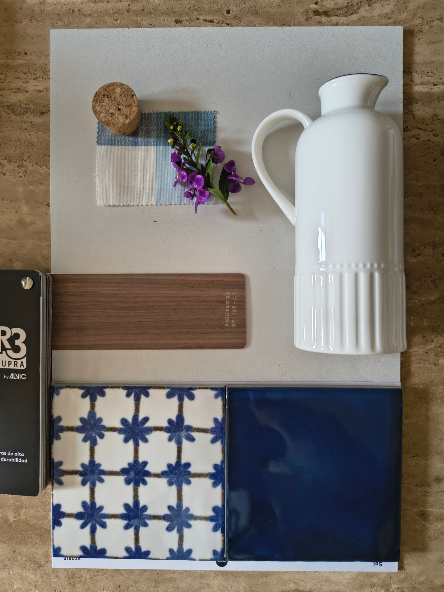
There's a very simple rule that works: 60-30-10. 60% of the room in a main colour (usually the walls), 30% in a second colour (sofa, curtains, rug) and 10% in an accent colour (cushions, ceramics, a painting, a chair).
It's not a law, but it avoids the most typical mistake: putting three colours in similar amounts so that none of them leads. A home feels calm when it's clear which colour is in charge.
Will this colour darken the room?
Many manufacturers publish a number next to each colour, the LRV, which runs from 0 to 100 and tells you how much light it reflects: 0 is total black and 100 is pure white. It's the quickest way to know if a shade will brighten or absorb a space.
- Above 70: whites and very light tones. They expand the space and bounce light back; ideal if the room has little window area.
- Between 40 and 70: sand tones, sage green, soft terracotta. They add character without darkening the space.
- Below 25: deep tones. Beautiful in rooms with plenty of light or in small spaces you want to turn into something special (a powder room, a study, a dressing room).
Orientation matters too. In a north-facing room the light is cooler and greys lean towards blue, so it's best to choose tones with a slightly warmer undertone. In a south-facing room it's the opposite: a beige can turn yellow at midday.
Test the colour on your own wall, not in the shop
The same colour changes depending on the light it receives. That's why a chart seen under a shop's fluorescent lights tells you nothing about how it will look in your living room.
- Paint a large square, at least half a metre by half a metre, with two coats.
- Do it on two different walls in the same room.
- Look at it in the morning, in the afternoon and at night under the artificial light you'll actually have.
- Wait 48 hours before deciding: many paints change slightly once fully dry.
The finish matters as much as the colour
The same tone looks different depending on whether the paint is matte or glossy, and each finish suits a different spot.
- Matte: the most attractive finish and the one that best hides imperfections on the wall. Perfect for ceilings and bedrooms, though it's harder to clean.
- Satin: the balanced choice for hallways, high-traffic areas and children's rooms. It can be cleaned without damaging it.
- Enamel or semi-gloss: doors, skirting boards, woodwork and damp areas. Very washable, though it highlights any flaw.
Paint and clean air
While it dries, paint releases gases (the well-known VOCs). There are low-emission water-based paints, and the tin usually carries labels such as A+ or the European Ecolabel. In bedrooms and children's rooms it's worth choosing these and ventilating well for the first few days: it's a matter of health, not fashion.
A good colour scheme goes unnoticed. What you do notice is when it's missing: that feeling that a home never quite feels finished.